 The other day, I met a musician at an SBA event. She shared that many years ago she exhibited at her 1st trade show and…
- Browse Trade
Show Products

Trade Show Displays

Trade Show Stands

Trade Show Booth Setup & Decor

Outdoor Trade Show Structures

Trade Show Accessories
$18.99
$25.00Sale
Color:Red/Dark blue/White
Product available
Product info
Style
- Banner Stand
Composition
- All-Aluminum Frame
- Venal Material
- Free Case
Art. No.
- 183260098
The other day, I met a musician at an SBA event. She shared that many years ago she exhibited at her 1st trade show and…
 First Timers Roadmap to Trade Show SuccessWe see you, Fabian in accounting, Janet the intern, or even Miguel the…
 When I think about being a CEO and business owner, the people I get to work with are the #1 reason I do what I do. I…
 Trade show floor space is the real estate market of the exhibitor space. Like the actual real estate and housing market,…
 There are two elements to surviving the trade show business. One is ensuring your exhibit and your show are a success,…
 An expertly executed exhibition event requires advance preparation, clear communication between all vendors, and a…
5 Best Green Booth Displays of All Time

Looking for green trade show booth design inspiration? Look no further. In this photo essay, we'll explore our top five all-time favorites. Ten years ago, few could have predicted the massive wave of innovation that would sweep across the trade show industry as a result of the Green Movement. Back then, eco-friendly exhibits were a hard sell for…
Business Travel, Leadership and Technology

The marriage between leadership, including business leadership, and technology has become such an important subject that the topic has been incorporated in master's degree programs at a growing number of colleges and universities around the United States. Perdue University leads the way in this type of degree program that weds leadership with…
Case Study: 4BF Skyrocketing Success with Trade Shows
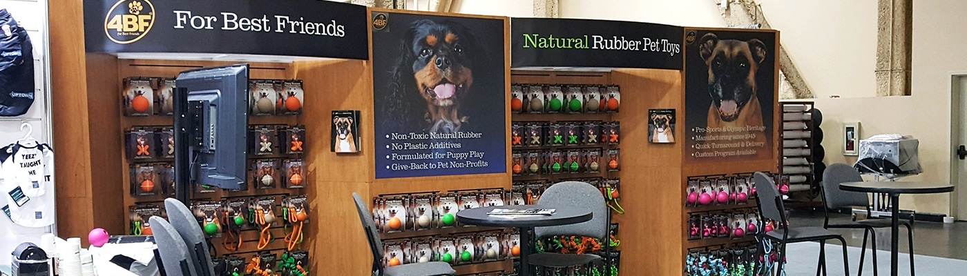
They say dog is man's best friend. We don't know about you, but we like giving our best friends only the, well, best. Enter 4BF (For Best Friends) , a dog toy company headquartered in Albuquerque, NM that produces the finest quality, non-toxic, plant-derived, natural rubber pet toys specifically formulated for pet safety and enjoyment.4BF is a…
Trade Show Display Basics: Start with a Branded Table Throw

If you're just getting started planning your company's first trade show, a branded table throw should be your first purchase. Not only is a logo-printed table throw a fantastic branding tool, but it can also be multi-purposed for use at a variety of other corporate events, from job fairs to holiday parties. Truth is, a branded table throw is so…
15 Trade Show Tips for First Time Exhibitors

So you've decided to exhibit at a trade show. Congratulations! This is going to be one of the hardest, most rewarding things you can do for your business. There's a lot more that goes into a successful trade show experience other than showing up. But have no fear, we're here to help you through your first trade show experience. We've compiled a…
Increase Trade Show Attendance and Booth Traffic with Targeted Email Campaigns

Email can be an effective and low-cost method for promoting trade show attendance and increasing booth traffic at your next event. But too often, marketers fall short by using a one-size-fits-all email strategy. Truth is, different audiences respond to different triggers, so the savvy email marketer should take time to develop targeted campaigns…