by Georgea
January 9, 2026


When you walk a trade show floor, it’s easy to spot which booths pull people in and which ones fall flat. Sometimes the message is unclear, sometimes the layout feels confusing, and sometimes visitors simply don’t know where to look. Brands invest heavily in visuals, materials, and buildouts, yet small missteps in the exhibition booth design process can quietly undermine the entire experience.
Most of these mistakes aren’t intentional. Teams try to communicate too much, prioritize aesthetics over flow, or add technology that distracts instead of supporting the story. And the result is always the same: less engagement, fewer meaningful conversations, and a booth that doesn’t perform the way it should.
The good news is that many of the most common design pitfalls are avoidable with the right approach and a clearer structure from the start.
Even well-intentioned teams can encounter issues that quietly limit the effectiveness of their booth. These problems usually start small but end up shaping how visitors experience your space, how your story lands, and whether people actually stop to engage.
One of the fastest ways to weaken your booth is by trying to communicate everything at once. When every surface competes for attention, visitors don’t know where to look or what matters most. Instead of guiding them toward a clear idea, the booth turns into a wall of text, logos, and unrelated messaging.
Imagine a visitor pausing for a moment, scanning multiple statements, and trying to piece together what your brand actually offers. Within seconds, interest fades and they move on. Not because your solution isn’t useful, but because the message never had a chance to land.
Clarity always wins. Strong exhibition booth design begins with a central idea, supported by only a few secondary points. When visitors immediately understand what you stand for, they are far more likely to stop, engage, and begin a real conversation.
Another common pitfall appears when design takes the lead before strategy is even defined. Many teams jump straight into renderings, choose hardware, approve layouts, and only then stop to ask what the booth is actually supposed to communicate.
This sequence leads to mismatched elements. The hero message doesn’t fit the available graphic zones. The key demo ends up pushed to the side. The visitor flow your reps need is impossible within the existing layout.
Design should support strategy, not dictate it. That is why we always begin with messaging, audience understanding, and the buyer journey. When those elements come first, the booth becomes intuitive to navigate, easier for the team to use, and dramatically more effective on the show floor.
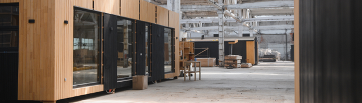
Even a visually impressive booth can fall short if the layout doesn’t support how people naturally move, pause, and interact. Flow is what turns a static space into an experience. When it’s off, engagement drops instantly, regardless of how attractive the booth appears.
It happens more often than teams realize. The booth looks stunning in the render; every material is premium, and the visuals are perfectly on brand. However, once the show starts, visitors wander in without knowing where to go or what to do. The space feels polished but passive. People pass through without connecting to the message or the team.
A layout that photographs well is not the same as a layout that performs well. To be effective, it needs to guide attention, create natural stopping points, and facilitate the team's ability to start conversations without forcing them.
These issues recur repeatedly, even in well-designed booths. They seem small on paper, but on a busy show floor, they can quietly drain momentum and make it harder for visitors to understand where to go or what to do.
A layout that truly works guides visitors through a clear and concise narrative. Each zone supports the next, helping people understand what you do, why it matters, and where they should go for the next part of the conversation.
Strong visuals can elevate a booth, but only when they reinforce the story you want visitors to follow. When graphics and lighting appear impressive but fail to capture attention, the booth becomes harder to read and more easily overlooked. Good design isn’t just about aesthetics. It’s about directing the eye, shaping perception, and helping people understand what matters first.
Beautiful graphics are not enough on their own. A striking visual without a message may catch someone’s eye for a moment, but it doesn’t tell them why they should care or what your brand actually does. When graphics are treated as decoration, they become background noise on a busy show floor.
Effective exhibition booth design uses visuals to create hierarchy. Large elements carry simple, memorable ideas. Smaller sections support those ideas with nuance or detail. Graphics should draw the visitor’s gaze exactly where you want it, step by step, rather than competing for attention all at once.
Lighting is often the quiet saboteur of booth design. It can make a strong message shine or make even the best layout feel flat and overlooked. Many booths rely on generic overhead lighting that washes everything out or creates shadows in the worst places.
Consider a simple comparison. A booth with dim corners and uneven illumination feels uninviting, making key elements harder to notice. A booth with focused lighting on the hero graphic and demo area instantly feels clearer, warmer, and more intentional. Visitors naturally gravitate toward what is visible and well-lit.
Good lighting doesn’t need to be dramatic. It just needs to support the flow, highlight what matters, and make the space feel inviting from a distance.
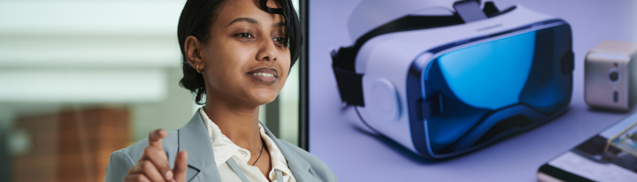
Technology can elevate a booth, but only when it reinforces the message instead of competing with it. Many exhibitors add screens, touchpoints, or interactive elements because they feel obligated to do so, not because those tools actually support the story they want to tell. The result is a scattered mix of elements that may grab attention for a moment but never guide visitors into the story you want to tell.
A common mistake is adding technology just because “every booth needs something digital.” When a touchscreen lacks a clear purpose, it becomes a distraction rather than a useful tool. Visitors tap around aimlessly, and the interaction ends with no real understanding of what your brand does.
The right question is simple: Does this piece of technology make the story easier to understand? If the answer is no, the booth is better off without it. Tech should simplify, clarify, or enhance the visitor experience, not compete with your team for attention.
Not every impactful moment requires a screen. Some of the most engaging booth experiences stem from well-positioned demos, clear product storytelling, or a hands-on element that naturally sparks curiosity. When exhibitors focus too much on tech, they often overlook these simple but powerful tools.
A compelling demonstration placed in the right spot does more for engagement than an unused digital kiosk ever will. The key is choosing tools that help visitors understand, explore, and remember your story.
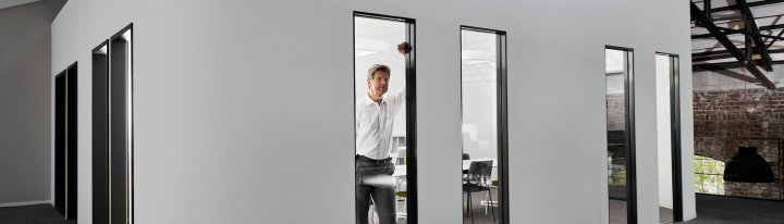
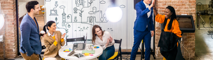
Even the most thoughtful booth concept can fall apart if it isn’t practical for the team running it. A great design must function effectively in real-world conditions, not just in renderings. When logistics, flow, or setup become obstacles, the booth becomes harder to manage, and the visitor experience suffers. These issues often appear, quietly draining performance long before attendees arrive.
A booth should support the people working inside it. When the design looks good on paper but doesn’t align with how the team interacts with visitors, everything becomes more challenging. Representatives struggle to move freely, materials are difficult to access, and conversations feel forced because the space doesn’t align with the way they work.
A good exhibition booth design makes interaction easy. It provides staff with clear zones for quick introductions, space for deeper conversations, and access to what they need without disrupting the flow. When the booth aligns with the team’s natural rhythm, visitors also feel that ease, and engagement improves.
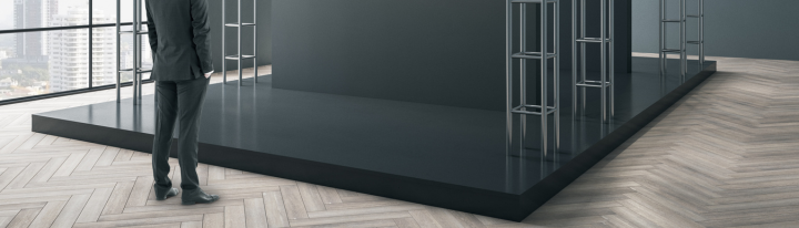
Complicated builds drain teams before the show even starts. Long installs, heavy crates, unclear assembly sequences, and last-minute adjustments all chip away at focus and energy. By the time the doors open, the team is already tired, and that fatigue shows in every interaction.
Modular systems solve much of this. They ship lighter, assemble faster, and reduce the stress that comes with tight schedules and busy show floors. When setup is predictable and efficient, the team arrives energized and ready to engage, not exhausted from wrestling with hardware.
The strongest exhibitors aren’t perfect. They simply follow a few habits that keep their booth focused, clear, and aligned with what visitors actually need. These habits make the difference between a space that looks busy and a space that works.
Here are the four practices brands rely on when they want consistent results:
At its best, exhibition booth design is a process that evolves over time. It’s not a pretty render. It’s a system that helps your team tell a clear story, start better conversations, and create a presence that performs on the show floor.
A successful booth isn’t built on luck. It’s built on clear messaging, smart flow, the right visuals, and a design that supports both your team and your visitors. When these pieces work together, the booth feels intuitive, engaging, and purposeful, not just attractive.
Great exhibition booth design blends marketing insight, an understanding of human behavior, and practical movement through space. It guides attention, encourages conversation, and helps your team do their best work without fighting the layout.
If you want a booth that avoids these common pitfalls and performs where it matters most, we can help you build a space that supports your story and strengthens every interaction on the show floor.
Georgea
Georgena